
Grid Micro Layouts
repeat
If all columns in a grid container should have the same width, the repeat function is convenient. Inside the parentheses, specify the number of columns and their width, separated by a comma. For example:
grid-template-columns: repeat(number of columns, column width);
This creates three columns of equal width, where 1fr means each column takes an equal share of the available space.
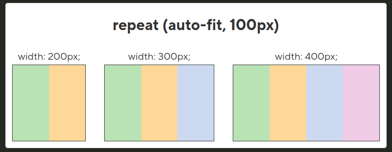
auto-fit
If the number of columns should automatically adjust to the width of the container, use the auto-fit value inside the repeat function instead of a fixed number of columns. For example:
grid-template-columns: repeat(auto-fit, minmax(200px, 1fr));
Here, the browser will automatically create as many columns as will fit in the container, with each column having a minimum width of 200px and distributing the remaining space evenly (1fr). This is especially useful for responsive layouts.
minmax
To make column widths dynamically adapt based on available space in the container, use the minmax function. It lets you set the minimum and maximum width for each column. For example:
grid-template-columns: repeat(auto-fit, minmax(150px, 1fr));
In this example, each column will have a minimum width of 150px, but if there is extra space in the container, it will be distributed proportionally among the columns (thanks to 1fr). This ensures flexibility and adaptability of the layout.
Properties grid-column and grid-row
To stretch an element across multiple columns, use the grid-column property. Use the span keyword followed by a number to specify how many columns the element should span. For example:
.element {
  grid-column: span 2;
}
This code stretches the element across two columns.
Similarly, to stretch an element across multiple rows, use the grid-row property. The span keyword defines how many rows the element should span. For example:
.long-element {
  grid-row: span 2;
}
This stretches the element across two rows.
You can combine the grid-column and grid-row properties to control both dimensions at the same time. For example:
.large-element {
  grid-column: span 2;
  grid-row: span 2;
}
This will stretch the element across two columns and two rows.
grid-auto-flow property
The grid-auto-flow property controls how elements are automatically placed inside the grid container. For example:
.grid-container {
  display: grid;
  grid-auto-flow: row;
}
The default value row means elements are placed in the order they appear in the markup, filling rows sequentially. If elements don’t fit in the current row, a new row is created. This ensures the usual behavior of placing elements left to right, top to bottom.
If you set the value dense for the grid-auto-flow property, the container will fill gaps to minimize empty space. For example:
.grid-container {
  display: grid;
  grid-auto-flow: dense;
}
In this case, if some elements occupy more space (e.g., span multiple columns or rows), remaining elements will be automatically placed in any available empty cells to avoid gaps. This is especially useful when items have different sizes and you want to efficiently use the available space.