
flex-direction in CSS
In the standard block model, directions like “left”, “right”, “top”, and “bottom” are fixed.
Enabling Flexbox
display: flex;
However, inside a flex container, these directions can change because the flow of elements can be redefined.
Changing the Direction
flex-direction: row; // Default value
In Flexbox, instead of using “left” and “right”, we operate with the concept of the main axis. The flow of flex elements follows this main axis — from its start to its end.
Example from the HTML Academy website:
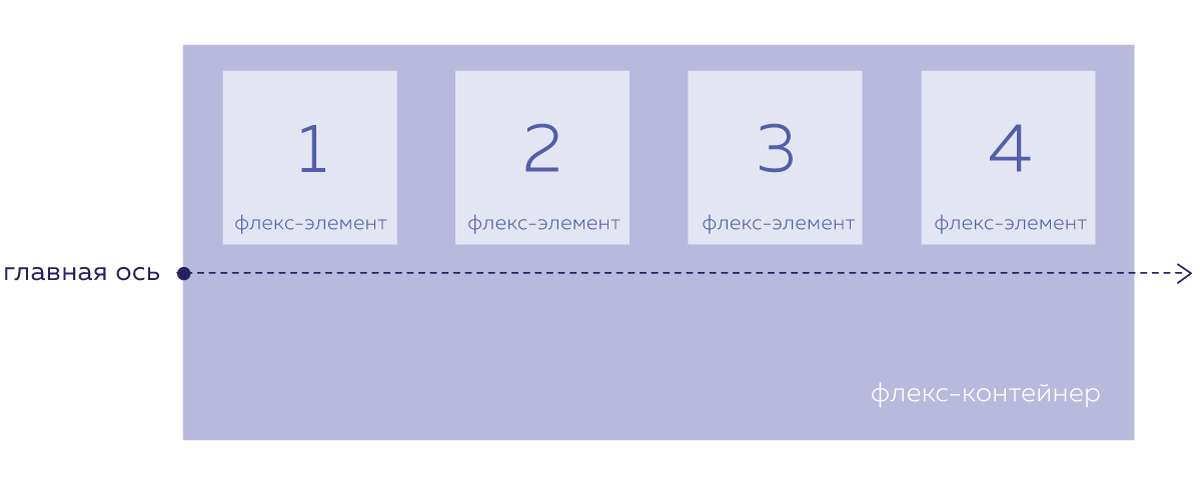
By default, the main axis runs from left to right. But it can be changed using the flex-direction property, which is applied to the flex container. Possible values for flex-direction:
row — Default. The main axis runs left to right.

column — The main axis runs top to bottom.

row-reverse — The main axis runs right to left.

column-reverse — The main axis runs bottom to top.
Flex elements are always laid out along the main axis, no matter its direction.