
The Display property in CSS
A rectangular area corresponds to each HTML element on the page. Such areas are called boxes.
By default, all HTML elements have certain boxes. However, the standard display of the box elements can always be changed using the CSS Display property.
The type of display immediately affects two things in the document flow:
- 1 For the location of the box itself.
- 2 Indicates the location of the child elements inside the box.
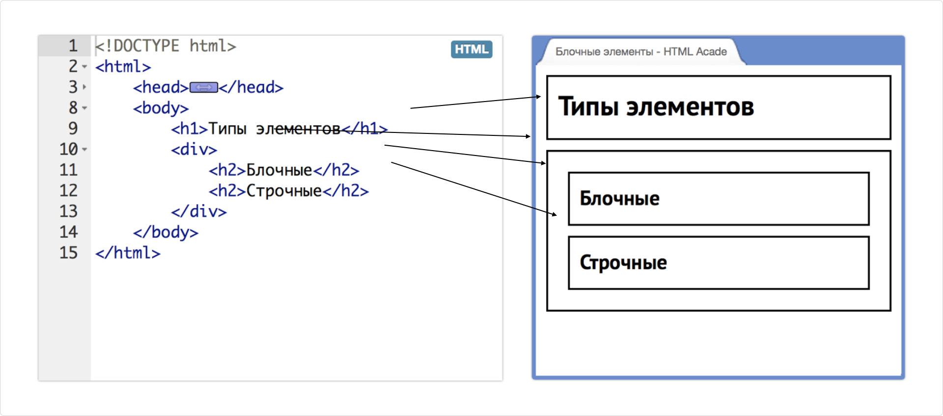
For example, the li element has a default display type.
display: block This means that the list items are displayed one below the other on the page.
.li {
    display: block;
}
If you change the value to display: inline, the list items will be displayed
one after the other, as if the words are located in the background.
.li {
    display: inline;
}
The ability to change the appearance of any element allows you to focus on their semantic meaning when selecting, without worrying about the visual representation. The appearance of the elements can be easily customized.
There are four main types of boxes in CSS
box types that define,
how elements are displayed and interact with other elements:
- 1 “Block box”
- 2-Line box
inline - 3 “Inline-block`
- 4 “Flexbox” and “grid” Flexboxes and Grids
Block box
A block box is a rectangular area on a page that is
just a rectangle. By default, large
flow-through elements that are not phrasal have block boxes.
For example, the following elements have default block boxes:div, h1, header, footer, section, p, ul, li
Block boxes have a number of key behavioral characteristics:
1 " The block box has a “selfish” behavior, manifested in the forced line hyphenation before and after it. This means that no other element can be on the same row., even if the block box contains little content or occupies only a small part of the row. It always remains the only one in its row.
2 " Block boxes are normally affected by all the properties of the block model:
width,height,margin,padding3” The height of the block boxes adjusts to the content, shrinking according to its size.
An example of the behavior of block boxes is shown in the picture below:
There are four elements inside the body tag, and all four are block elements.
It can be seen that the lines of text inside the h2 are very short,
and the elements could shrink to fit the size of the text.
However, the headers stretch to the full available width of the parent container,
minus the internal margins.
In addition, if the headlines were compressed to fit the content, they would fit on one line. But each of them occupies a separate line.
Lowercase boxing
Lowercase boxes are the exact opposite of block boxes. If a block box is a large, unbroken rectangular area, then a lowercase box is a piece of text that can be torn and arranged on several lines.
The elements whose boxes are lowercase by default are tags designed
to mark up small fragments of text or phrases:a, span, button, strong, em, i, b, time
Lowercase boxes have several differences from block boxes:
1 Lowercase boxes behave similarly to text, that is, they can be located on one line or on several. If such a box does not fit within one row, it is automatically moved to the next.
2-row boxes are not compatible with the properties of the block model. Some properties do not affect them at all, while others only partially. For example, the margins in lowercase boxes only work horizontally.
3 The sizes of the row boxes are always determined by their contents.
In the example below, thanks to the backlight, you can see, how does a lowercase box behave when it doesn’t fit in a row.
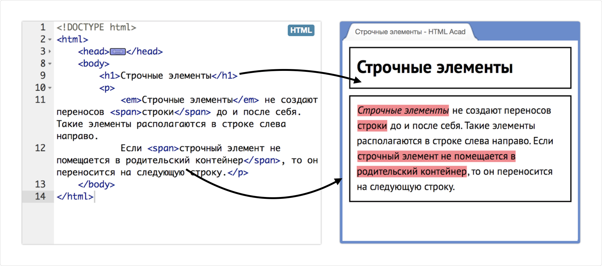
Lowercase boxes are not only em and span tags, but also plain text
that is not wrapped in a phrasal tag. Such text fragments are automatically
wrapped in an anonymous lowercase box. In the considered example, there are three such anonymous boxes
(these are sections of text between explicit lowercase boxes belonging to tags).
Block-line boxing
A block-lowercase box is a type of boxing in CSS that combines the properties of both block and lowercase boxes.
Elements with display: inline-block lead
They behave like lowercase elements,
that is, they are located in a row and can be next to
other elements, but they can have specified widths,
heights, margins, and margins, like block elements. This allows you to control the size and
location of the elements, while maintaining their ability to fit in a row.
Flexboxes and Grids
Flex grids are the main tool for building large grids and microgrids.
When using flexos, it is important to consider several features that should be kept in mind:
All blocks easily become “flexible” thanks to the name
flex. The elements can shrink and stretch according to the set rules, taking up the necessary space.Vertical, horizontal, and baseline alignment of the text works fine.
The layout of the elements in HTML is not decisive. It can be changed using CSS.
Elements can automatically form multiple rows or columns, filling all available space.
The syntax of CSS rules is very simple and learns pretty quickly.