
Base Sizes of Flex Items
The algorithm for calculating the sizes of flex items and distributing them within a flex container involves three sequential steps. This process is significantly more complex than in the traditional block model.
Step One – Determining the Base Size of Flex Items
The base size is the size of the item measured along the main axis.
The base size is the size a flex item takes without using additional flex model features. It’s defined by standard block model properties (e.g., width, height, padding, border) and the content inside the element.
If the main axis is horizontal, the base size is affected by:
- The
widthproperty or, if not set, the content width (e.g., the length of the longest word) - Horizontal paddings
padding - Horizontal borders
border
If the main axis is vertical, the base size is affected by:
- The
heightproperty or, if not set, the height of the content, such as the number of text lines - Vertical paddings
padding - Vertical borders
border
Margins and borders behave logically: depending on the main axis direction, the base size includes either vertical or horizontal margin/border components.
Regarding width and height, the behavior isn’t as straightforward. When the main axis is horizontal — we use one property, when vertical — another. Because of this, the flex-basis property was introduced.
It defines the size of the content area along the main axis, regardless of its direction. flex-basis takes priority over width and height, overriding them if they are also specified on the same flex item.
You can use width/height without flex-basis, and vice versa — that’s acceptable too. Just remember how these properties behave depending on the main axis direction.
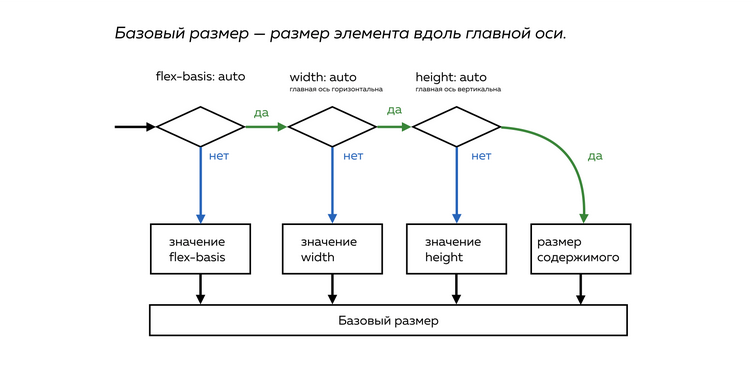
The base size of a flex item is determined as follows:
Step 1:
- If
flex-basisis specified (and its value is notauto), its value is used as the content area size. Go to step 5. Otherwise, go to step 2.
Step 2:
- If the main axis is horizontal and
widthis specified (and it’s notauto), thenwidthis used. Go to step 5. Otherwise, go to step 3.
Step 3:
- If the main axis is vertical and
heightis specified (and it’s notauto), thenheightis used. Go to step 5. Otherwise, go to step 4.
Step 4:
- The content area size is calculated based on the actual content size along the axis. This can be non-trivial, so it’s better to avoid such cases when building layouts to retain control. Go to step 5.
Step 5:
- Add paddings and borders along the main axis to the content area size to get the base size.
Important rule: when building layouts, always specify either flex-basis or width/height.
After determining the base size of all flex items, the browser calculates the remaining free space in the container. If there’s extra space or not enough, the “flexibility” of the items kicks in. That’s the second stage.