
Applying Flexible Sizes in Flexbox
The algorithm for calculating the sizes of flex items and their distribution within a flex container involves three sequential steps. This process is significantly more complex than in the traditional block model.
Step Two – Applying Flexible Sizes
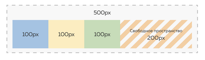
Let’s start with an example. The width of the flex container is 500px. Inside, there are three flex items, each with a base size of 100px. There is no padding, so the remaining free space in the container is 500px - 300px = 200px.
In the standard block model, those 200px would be unused since element sizes are determined in a single pass. In Flexbox, however, element sizes are recalculated multiple times. In the second step, the free space is redistributed, but only among “flexible” elements. Flexibility comes in two forms: growing and shrinking.
The flex-grow property is responsible for growing flexibility — the ability of a flex item to take up additional free space. It accepts numeric values and defaults to zero, meaning items do not claim extra space by default. If you set flex-grow to a value greater than zero, the flex item will begin to occupy the available free space in the container.
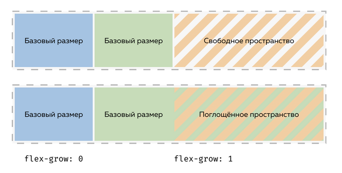
Look at the image. Inside the flex container are two items and some remaining space. If we set flex-grow: 1 on one item, it will take all the free space. If both items have flex-grow: 1, the free space will be split equally between them.
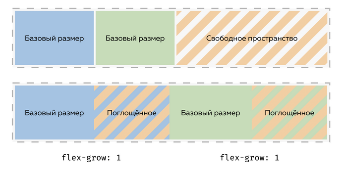
When flex-grow values are equal, the space is distributed evenly. If the values differ, the distribution is proportional.
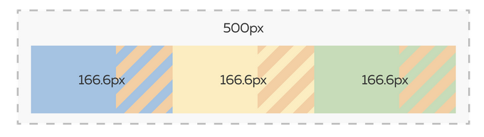
Returning to our example with a 500px container and three 100px elements. If we set flex-grow: 1 on each, they will share the 200px of extra space equally — 66.6px each. The final base size of each item becomes 166.6px. Keep in mind, this is not the original size but the final base size (which may still change later).
flex-grow is useful for creating responsive layouts where strict column proportions aren’t necessary. If you need precise widths, like having each column take exactly 30% of the parent, use width: 30% or flex-basis: 30% — not flex-grow.
The flex-shrink property controls shrinking flexibility. It also accepts numeric values and defaults to one, meaning flex items can shrink if the container lacks sufficient space after base sizes are defined. Note that only the content area shrinks — paddings, margins, and borders remain unchanged.
flex-shrink is used less often because it’s usually unnecessary. If your grid has many items, it’s better to enable a multi-row flex container, which makes flex-shrink irrelevant in most cases. For column-style layouts, it’s generally a good idea to disable shrinking for better consistency.